Homepage › Boards › Comic Books! › Image Comics › Youngblood #71
Tagged: Jon Malin, Rog Liefeld, Youngblood
- This topic has 0 replies, 1 voice, and was last updated 11 years, 11 months ago by
E.J..
-
AuthorPosts
-
May 28, 2012 at 10:50 pm #769
E.J.
Keymaster
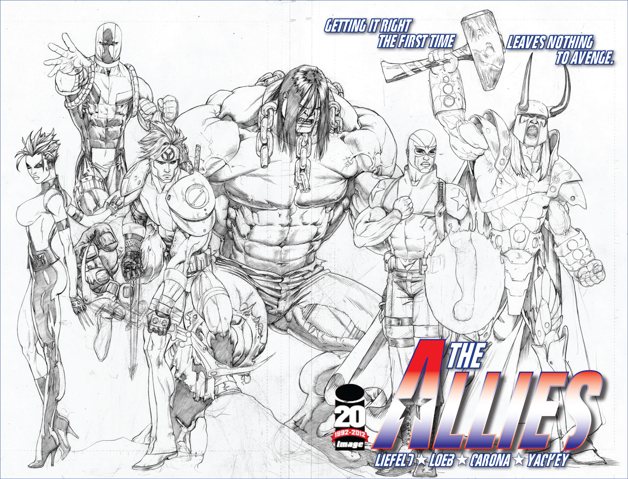
 Story by: John McLaughlinArt By: Jon Malin & Rob LiefeldCover By: Rob LiefeldVariant Cover by: Ryan OttleyPrice: $2.99
Diamond ID: MAR120405
On Sale: May 23, 2012
Genres: Superhero
Series: YoungbloodSynopsis:
It’s the 20th anniversary of the comic book that launched the Image Revolution in 1992! ROB LIEFELD’s YOUNGBLOOD returns bigger and better than ever with an all-new look at the next generation of superheroes, courtesy of screenwriter JOHN McLAUGHLIN (Black Swan, Parker), up-and-coming artist JON MALIN and YOUNGBLOOD creator and Image founder ROB LIEFELD!
In this first issue, a young reporter is embedded in the Youngblood team. Her assignment is to gather enough information for a humiliating puff piece, but she quickly discovers Shaft, Vogue, Lady Photon, Die Hard and Cougar are a team to be reckoned with. Badrock would be part of the group too… if he wasn’t in a coma with wounds that have nearly pulverized his otherwise rock-hard hide.Review:
I enjoyed this issue to the highest possible level. The issue opens up with with at cover to an old school, mock, Youngblood cover retailing for a $1.95 (Man, those were the days!) It’s cool becauee you’re kinda reading along and and thinking what’s going on and who is this Golden Stream guy, then juxtaposed to awesome details like the coffee ring and the giant thumb on the following page and you realize it’s a comic which is being read by Gail Cook, reporter for Entertainment Now. She makes a snide remark about the comic and over the next couple of pages Her purpose is to revitalize the image of Youngblood who have fallen to ill favor in the public eye.
The introduction to Cougar & Diehard are a fast paced 4 pages illustrated by the man himself, Rob Liefeld, as the two characters round up a couple of crooks in over the top style. I’ve never really been a fan of Cougar but it’s was really great to see Diehard in action in only the way Liefeld can deliver! Great stuff that brings back good times the early 90’s.
The rest of the book sets up the team and their dysfunctional relationship with the new team leader who happens to be named “Shaft”. With dark hair featuring a skunk white streak right up the middle and a blue suit with white trim you’re like . . . . what . . . who’s this dude. The other members like to rib him by calling him “Not Shaft” in front of Gail. when she’s introduced to them for the first time.
Waisting no time at all, McLaughlin, reveals awesome characterizations of the rest of the team in a matter of 4 pages before the team is scrambled for a mission threatening a shopping mall in Virginia.
So what happened to the Original Shaft? We get a brief look at where he’s been in an interesting subplot point but you’ll have to check out the book to see what’s doin’.
The mission and the book conclude to one unnerving question and the reveal will have you wanting the next issue right now!
THE GOOD:
Jon Malin! I really don’t have to say anything more. . . but I will. His art on this title is 90’s gold, bringing back that era for me with rich comic book dynamics and sexy women, there wasn’t a miss anywhere in this book for me and the opening comic pages are a credit to his ability. I can’t wait to see what new issues reveal of his art as the story progresses. He’s got every aspect of the medium down and I love his rendition of Vogue!
Rob Lifeld’s pages! Always great to see him on his characters. His work is truly and inspiration for a era of creation that thrives to this day.
Sex! Yeah man, not that there was any actual sex in this issue, but there was a lot of blatant innuendo and I have to say that I liked it! From Vogue’s sexual harassment of Diehard to Photon’s cozy statement to Cougar, this has all of the elements of a prime time show with something for everyone!THE BAD:
There was a little coloring mishap that landed me right into a “Wait a minute!” moment where on some pages “Not Shaft” has blue shoulder pads and in the rest of the book the shoulder pads are tan/brown. I’m just surprised that no one caught this before the pages hit the printer, as it did take me out of the story for a moment.
THE VERDICT:
Pure awesome! Coloring snafu aside I loved the book as a whole. The attention to detail on the fake comic in the opening pages with the coffee ring and the light harted approach to the characters and the era that it represented was great! The characterizations of the individual team members was handled brilliantly and that art by Malin was something special to behold! I’m so glad to see these characters back in books and I hope that this is the beginning of a new and long lasting era for Rob and his cavalcade of creations!

Commissions | Deviant Art | Twitter | Facebook | MySpace -
AuthorPosts
- You must be logged in to reply to this topic.